Shopify · DTC personal care · Antiperspirant
DON’T CALL IT DEO®: Shopify Optimization & Redesign
I optimized an existing German-language Shopify store for DON’T CALL IT DEO®, expanding the merchandising system from one product line to two while clarifying retail availability, product education, mobile navigation, and content hierarchy.

These are observable scope changes from the supplied captures, not revenue or conversion metrics.
Capabilities used
- Shopify theme development
- Storefront UX and responsive implementation
- Product and collection page optimization
- Content architecture
- Mobile navigation
- FAQ and editorial templates
01 · The challenge
What problem was the Shopify store solving?
The brand already had a live Shopify store, client-supplied design direction, and a strong founder story. The brief was to improve the existing experience as the business matured, not to erase what already worked.
The storefront needed to support a broader product range, make pharmacy and drugstore distribution easier to see, simplify dense content, and create a more consistent experience across mobile navigation, product discovery, FAQs, founder content, and the German-language advice hub.
02 · CRO content architecture
What changed, and why it matters
The redesign makes each key page answer a conversion question: what is this, is it for me, why should I trust it, and what should I do next?
| Area | Before | After | CRO purpose |
|---|---|---|---|
| Product range | Fluid plus two bundles | Fluid, Body Tonic, and four bundles | Serve more use areas and basket sizes |
| Retail proof | Trust and press lower in the journey | Six retail partners near the opening | Reduce perceived purchase risk early |
| FAQ | Roughly 36 questions | About 17 customer-led questions | Lower scanning and decision effort |
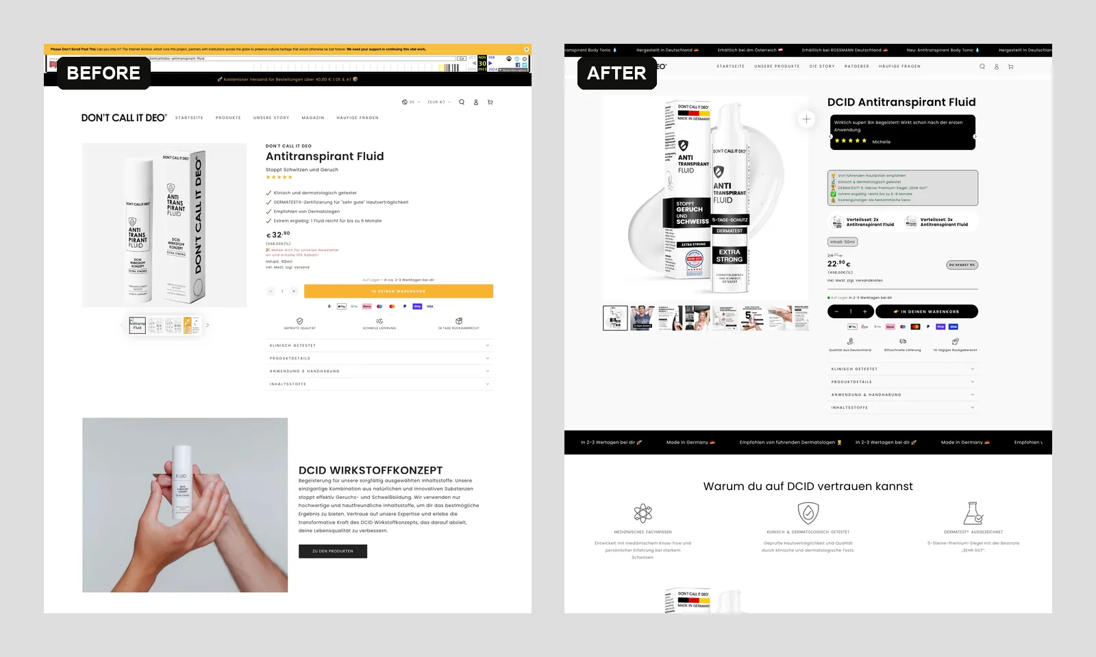
| Product detail | Useful but dispersed buying information | Promise, proof, bundles, price, and CTA grouped | Strengthen purchase hierarchy |
| Editorial | Magazine-led archive | Consistent advice-hub system | Support discovery and product education |
03 · Interactive evidence
See the redesign, not just the summary.
Choose a storefront area, then drag across the first viewport. Full-length captures are linked below each comparison.

Homepage: The opening journey shifts from a broad brand introduction to a clearer problem-solution story, with retail availability, products, founder credibility, and education arranged as one conversion path.
04 · The approach
How I improved the storefront
I worked directly with the brand as the solo Shopify developer. The implementation treated the live store as an evolving system: retain the useful foundations, introduce clearer modules, and extend proven patterns where the product range grew.
- Worked from the existing theme and supplied design direction.
- Built and refined responsive storefront sections across key templates.
- Reduced duplicated or overly dense homepage content into more scannable modules.
- Made product purpose, founder credibility, retail availability, and trust signals easier to find.
- Reorganized FAQ and editorial content around clearer customer questions.
- Applied the storefront system to the newer Body Tonic line and its bundles.
05 · Shopify delivery
What was delivered across the customer journey?
- Homepage optimization with a clearer product journey and retailer trust layer.
- Responsive navigation and mobile storefront behavior.
- Updated product collection and merchandising for two product lines and their bundles.
- Refined Antitranspirant Fluid product page and a dedicated Body Tonic product experience.
- Founder story, FAQ, advice index, and article template updates.
- Consistent trust, social proof, press, community, and newsletter modules across the storefront.
Responsive experience
The mobile journey keeps momentum.
Navigation, retail proof, product discovery, education, and founder credibility now form a clearer sequence for customers browsing with one hand.
- Compact navigation and product access
- Retail availability visible early
- Touch-friendly cards and content rhythm
- Motion that respects reduced-motion settings

Responsive delivery gallery
One storefront system, designed across screens.
Switch between desktop and mobile evidence. Every slide explains the customer journey improvement visible in the supplied captures.
desktop evidence
Homepage journey
Retail availability, product discovery, founder credibility, and education now form a more deliberate path from promise to purchase.
06 · Evidence-led outcome
What results can be verified?
The current live storefront presents the Fluid and Body Tonic ranges in one coherent merchandising system, with matching single-product and bundle options. Retail partners, including dm Österreich, ROSSMANN Deutschland, Amazon, Shop Apotheke, DocMorris, and medpex, are now surfaced prominently near the start of the journey.
Before-and-after captures also show a more focused FAQ, a more consistent visual language across product, story, and editorial templates, and a simplified responsive/mobile experience. These are observable delivery outcomes; no conversion-rate or revenue uplift is claimed because analytics were not supplied.
Case study FAQ
Questions a buyer may ask
Was this a full Shopify rebuild?
No. This was an ongoing optimization and redesign of an existing Shopify store. The work kept useful brand foundations while improving merchandising, content hierarchy, responsive behavior, and consistency across key templates.
What was your role in the project?
I worked as the solo Shopify developer, translating the supplied direction into storefront changes across the homepage, collection, product, story, FAQ, editorial, and mobile experiences.
Which outcomes can be verified?
The supplied before-and-after evidence supports the expanded product range, six visible retail partners, a simplified FAQ, clearer product merchandising, and a more consistent responsive visual system.
Did the redesign increase conversion rate or revenue?
No commercial uplift is claimed here because analytics were not supplied. This case study separates observable design and content changes from performance results that would require verified store data.
What would the next CRO phase measure?
A measurement phase would track product-view-to-cart rate, bundle uptake, mobile checkout progression, FAQ-assisted journeys, and conversion by acquisition source before prioritizing the next controlled tests.
Need a similar Shopify outcome?
Turn visible friction into a prioritized CRO roadmap.
Start with one contained storefront outcome, work safely in a duplicate theme, and keep a documented path to QA and rollback.